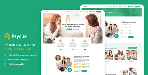
Designing a web template involves creating a layout that is visually appealing, functional, and user-friendly. Here’s a guide to creating an effective web template design:

1. Understand the Purpose and Audience
- Purpose: What is the primary goal of the website? Is it for e-commerce, personal branding, blogging, corporate, or portfolio? The purpose will guide the layout, colors, typography, and other design elements.
- Audience: Who is your target audience? This will influence the design choices such as simplicity for a younger audience or professionalism for a corporate audience.
2. Structure the Layout
A clean and organized layout is essential for usability. A web template should be divided into various sections, such as:
- Header: Contains the website logo, navigation menu, and sometimes a call-to-action (CTA) button or search bar.
- Hero Section: A large area at the top of the page often used to showcase a key message, product, or feature. This may include a background image or video, heading, and CTA button.
- Main Content Area: Where the bulk of the content resides, such as blog posts, product descriptions, or services.
- Sidebar: Optionally placed on the left or right side for additional content like social media links, a newsletter signup form, or featured products.
- Footer: Contains links to important pages like privacy policy, terms of service, contact information, and social media icons.
3. Design Principles
- Visual Hierarchy: Use size, color, and spacing to highlight the most important information first.
- Responsiveness: Design the template to adapt well to different screen sizes, including desktops, tablets, and smartphones.
- Consistency: Keep design elements like buttons, fonts, and colors consistent across the template.
- Whitespace: Adequate space around elements makes the website easier to read and navigate.
- Typography: Choose easy-to-read fonts for both headers and body text. Use a maximum of two or three complementary fonts.
- Color Palette: Select a color scheme that matches the brand identity and creates the right mood (e.g., blue for trustworthiness, green for health).
- User Experience (UX): Prioritize fast loading times, intuitive navigation, and clear calls to action (CTAs).
4. Key Elements to Include
- Navigation Menu: Include a top or side navigation bar with links to important sections of the site. It should be simple and easy to use.
- Call-to-Action (CTA): Whether it’s a button or link, a CTA should stand out and encourage users to take action (e.g., “Sign Up,” “Shop Now”).
- Grid System: Use a grid system for organizing content in a structured, easy-to-read manner. This is essential for responsiveness.
- Images and Icons: Use high-quality images and icons that fit the overall design. Ensure they are optimized for web use to avoid slowing down the site.
- Forms: Include forms for contact, newsletter sign-ups, or feedback. They should be simple and not overwhelming.
- Social Media Integration: Add social media icons and links to encourage visitors to follow the brand.
5. Optimize for Speed
- Compress images and files.
- Use SVGs for vector-based icons and logos.
- Minimize external scripts and CSS to reduce loading time.
6. Add Interactivity and Animations
- Hover Effects: Use hover effects on buttons and images to provide feedback to users.
- Transitions: Smooth transitions between pages or when elements appear/disappear can make the experience more engaging.
- Scroll Animations: Subtle animations triggered by scrolling can make the template feel dynamic.
7. Testing and Feedback
- Test the design on different devices and browsers to ensure it looks good everywhere.
- Gather user feedback to make improvements and ensure the template meets user needs.
Example Structure for a Web Template
- Header:
- Logo on the left
- Navigation menu centered
- Search bar or CTA button on the right
- Hero Section:
- Background image with text overlay
- Primary CTA button (e.g., “Learn More”)
- Main Content Section:
- Three or four columns for different content types (e.g., blog posts, services, testimonials)
- Footer:
- Contact info, social media links, and additional navigation links
By following these guidelines, you can create an effective, responsive, and aesthetically pleasing web template design that caters to both users and your website’s objectives.